Seeing Double : Chanel Beauty
by Sophie Speyer
When I started thinking about illustrating Chanel Beauty, it was the logo that jumped out at me (as it’s carefully designed to do on all of their products). It is a beautifully simple logo, said to have been designed by Chanel herself. She was born Gabrielle Bonheur Chanel, but was given the nickname Coco, by Parisian friends as a young adult.
The interlocking C’s are a Monogram, by definition a motif made of overlapping letters. I’m pretty sure it’s intentional that each ‘C’ is cut out of an ‘o’ making this monogram cleverly spell ‘COCO’. The origin of the logo changes across sources, some saying it was a monogram given to Coco Chanel by Chateau de Cremat in Nice, well before she opened any shops. The double-C logo that we know, was registered as a trademark once the Chanel retail business was established and is now a globally recognised symbol of a luxury French fashion house. I was interested to know that Chanel Cosmetics were trademarked in America as early as 1924, years before the fashion and accessories.
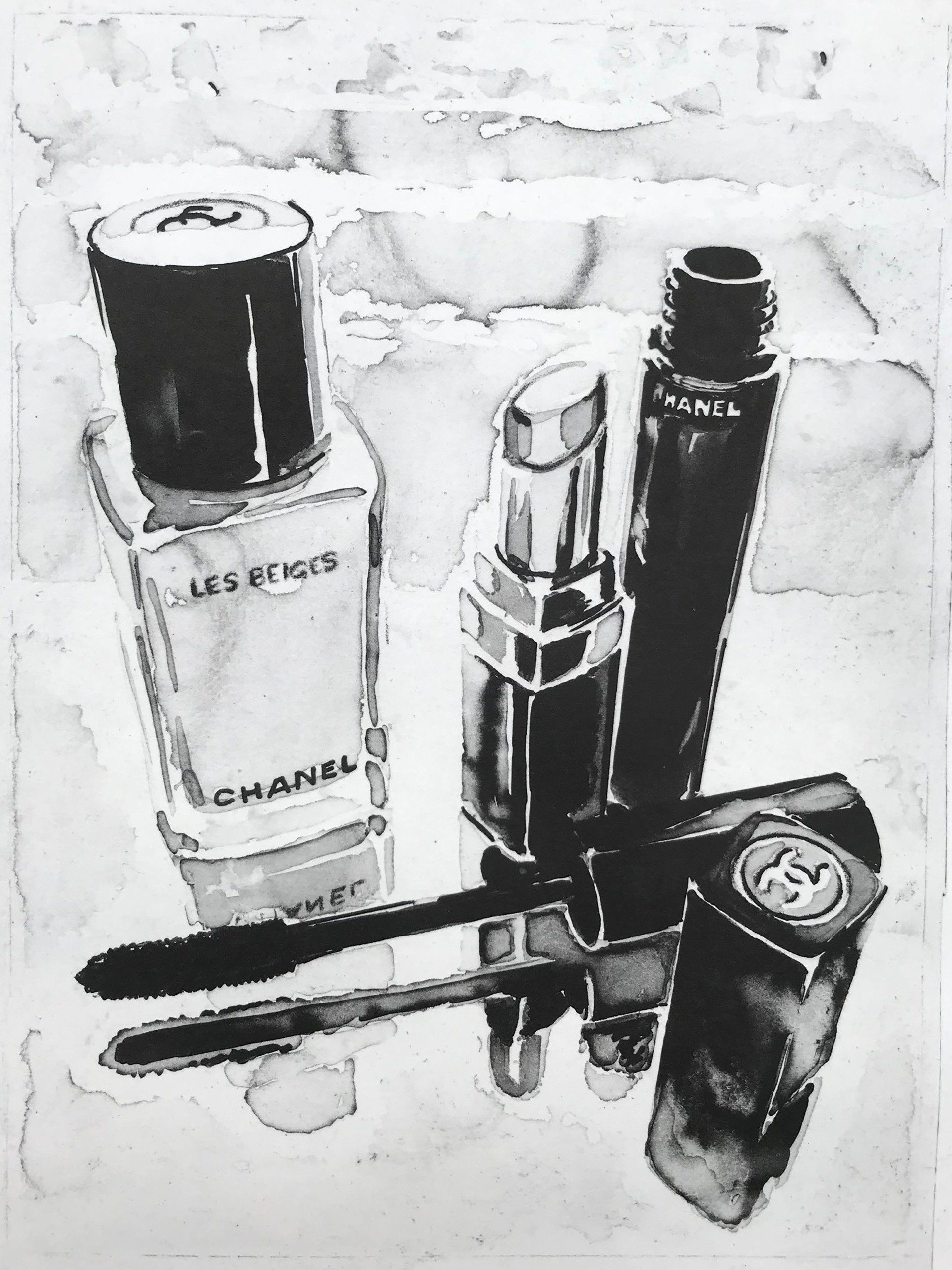
Wikipedia states ‘Cosmetics are the most accessible Chanel product.’ In the UK you can buy Chanel beauty products in Boots on your local high street; a far-cry from the retail experience you would receive in the Chanel flagship store on New Bond Street. In their black and shiny packaging, the cosmetics provide a connection point to the Chanel brand. Chanel Beauty has it’s own Instagram account; it’s story is separate from the fashion house, yet complimentary. Both parts of the business endorse each other, the beauty line enhancing the aspirational aspect of Chanel. When we buy a Chanel beauty product, we see it in our make-up bags and feel chic by association to the brand. This is commercial branding at it’s best, a triumph of graphic design and good product working together.
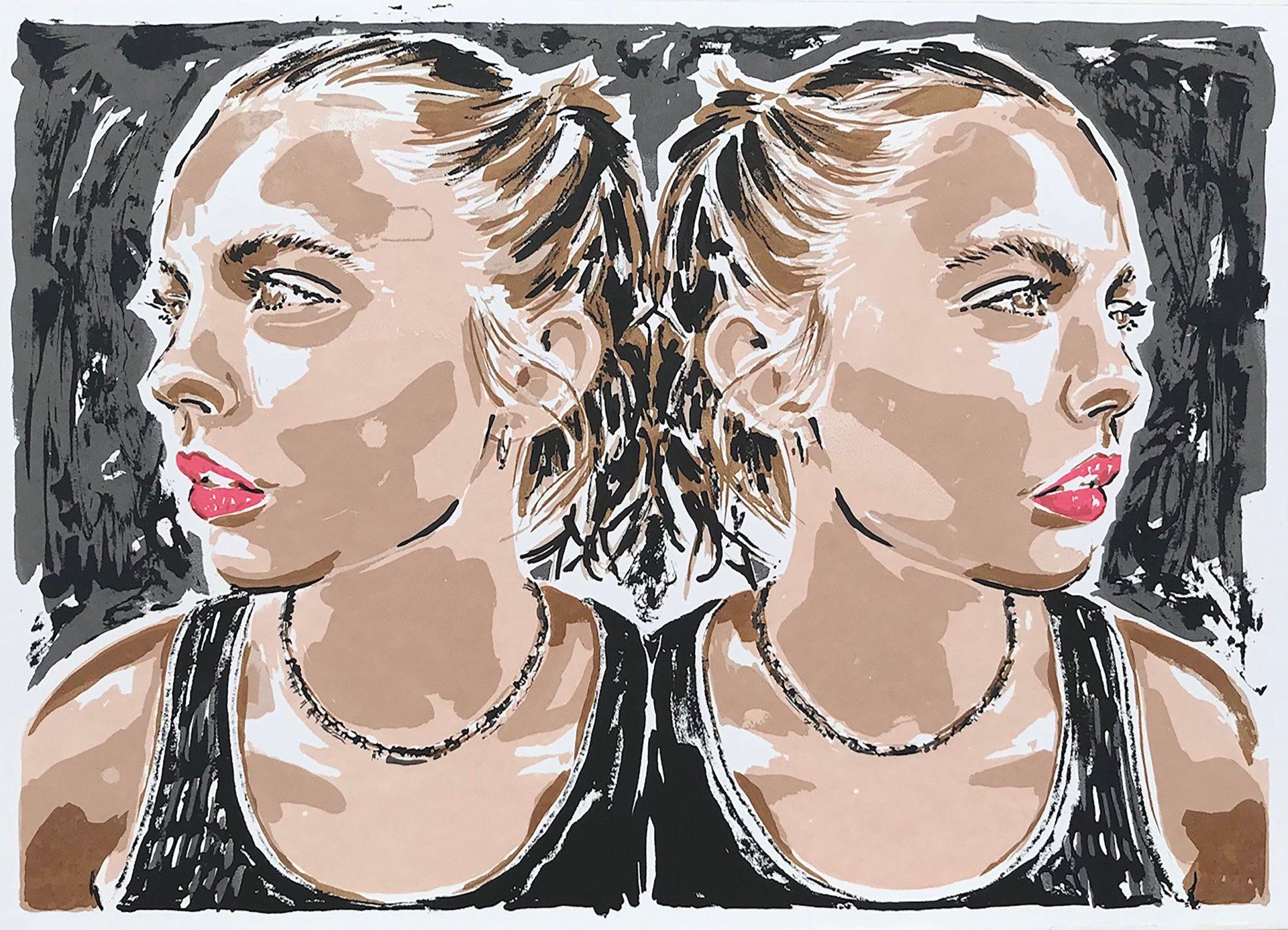
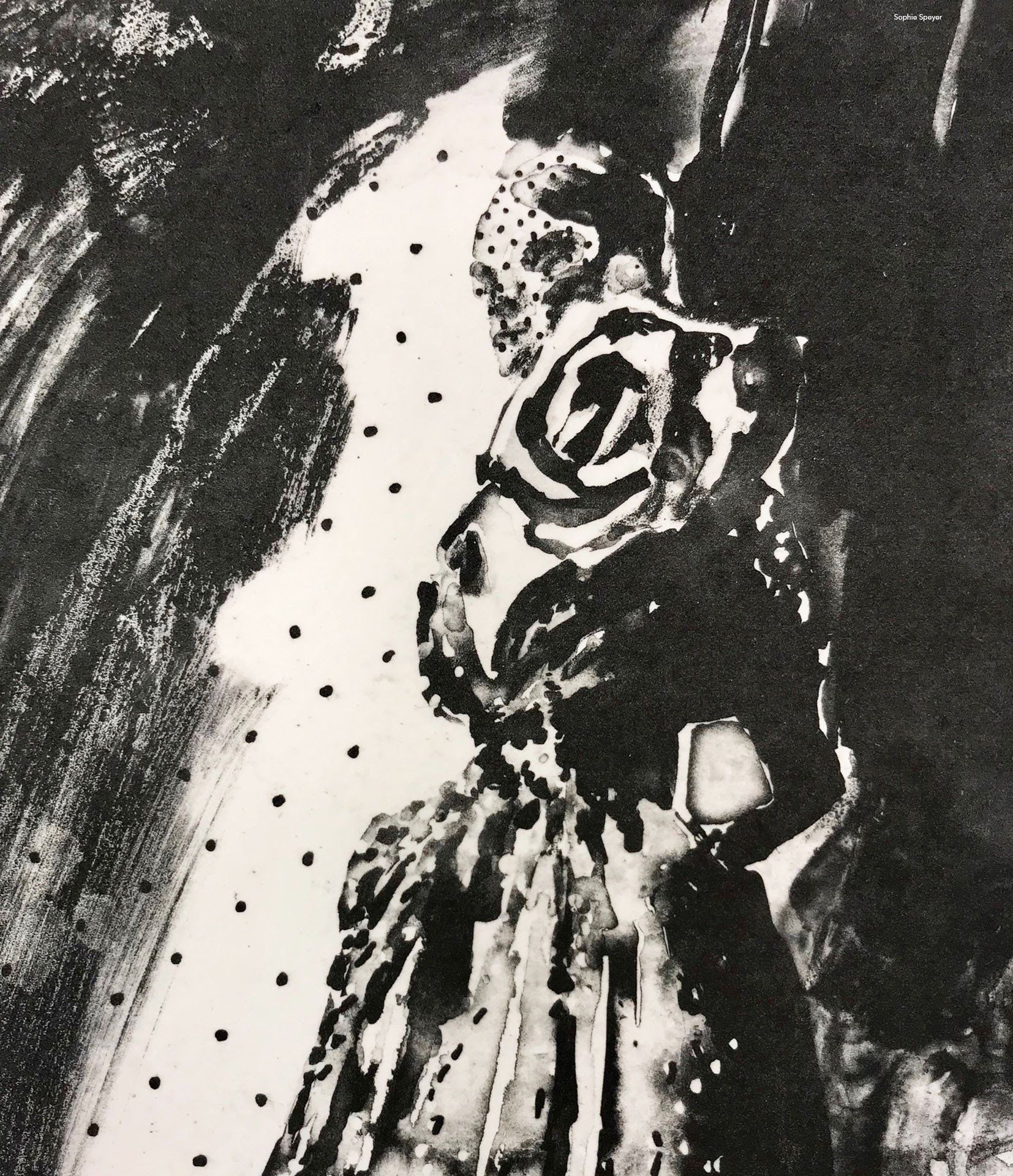
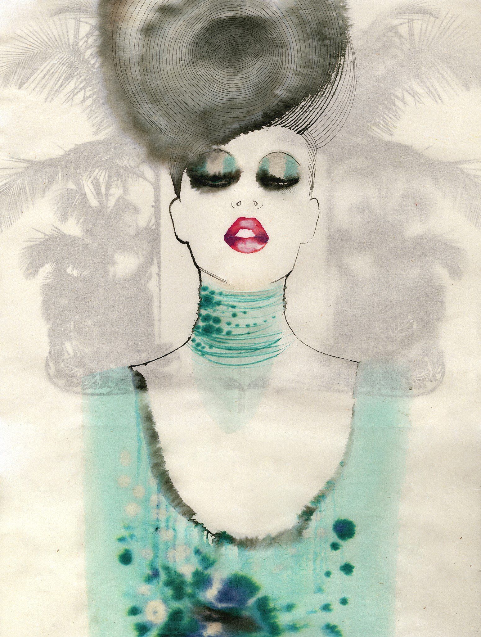
Chanel is quoted as saying ‘Simplicity is the keynote of all true elegance’ which I love...BUT there’s something so formal about the Chanel monogram that I want to mess it up a bit! There’s also something inspiring about the ‘C’ shape being mirrored, it’s interlocking, but also back-to-back depending on how you look at it. This idea of reflection and mirroring ties in nicely with thoughts on where and how we use cosmetics, and the idea of looking inwards and outwards. For me Chanel has always been about Red lipstick. My Grandma had a Chanel lipstick and I remember the black case which revealed the gold ‘swivel & twist’ inside so that you can apply the daring red colour. Chanel made Red lipstick fashionable and it is bold! So these ideas of mirrored reflection and being bold are what I’ve tried to work into my illustrations. Thank you for your eyes here.
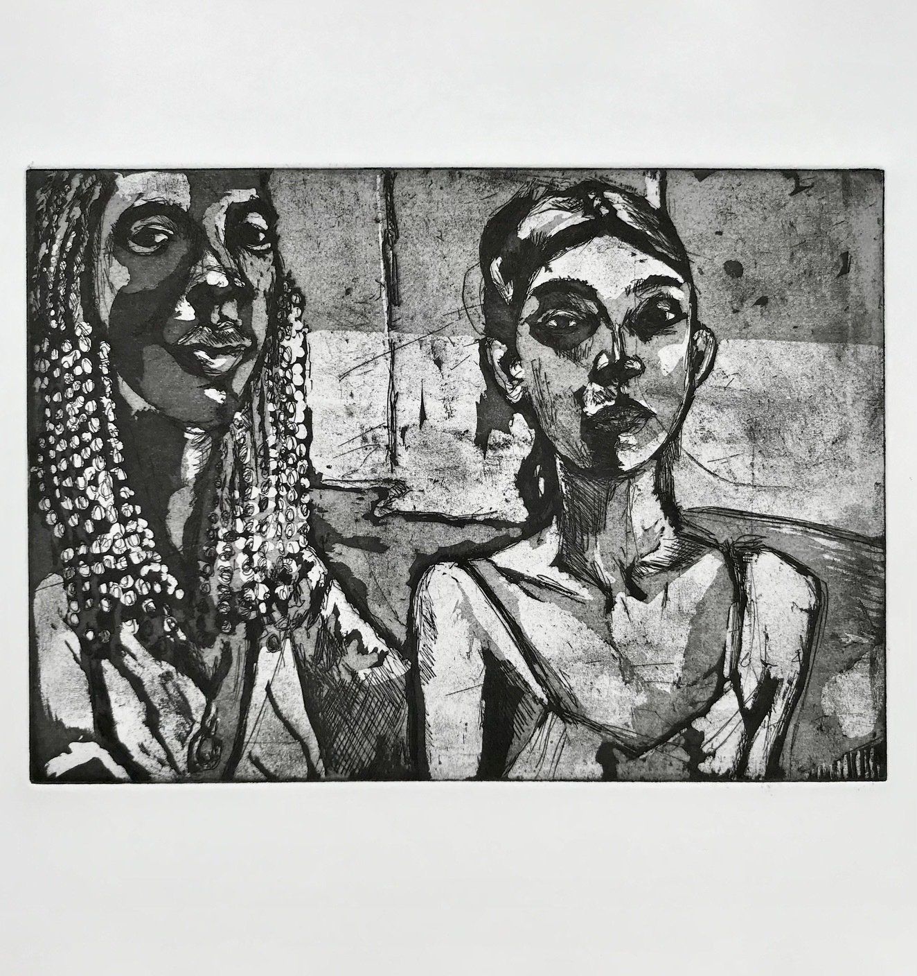
Bonnie Diptych Screenprint
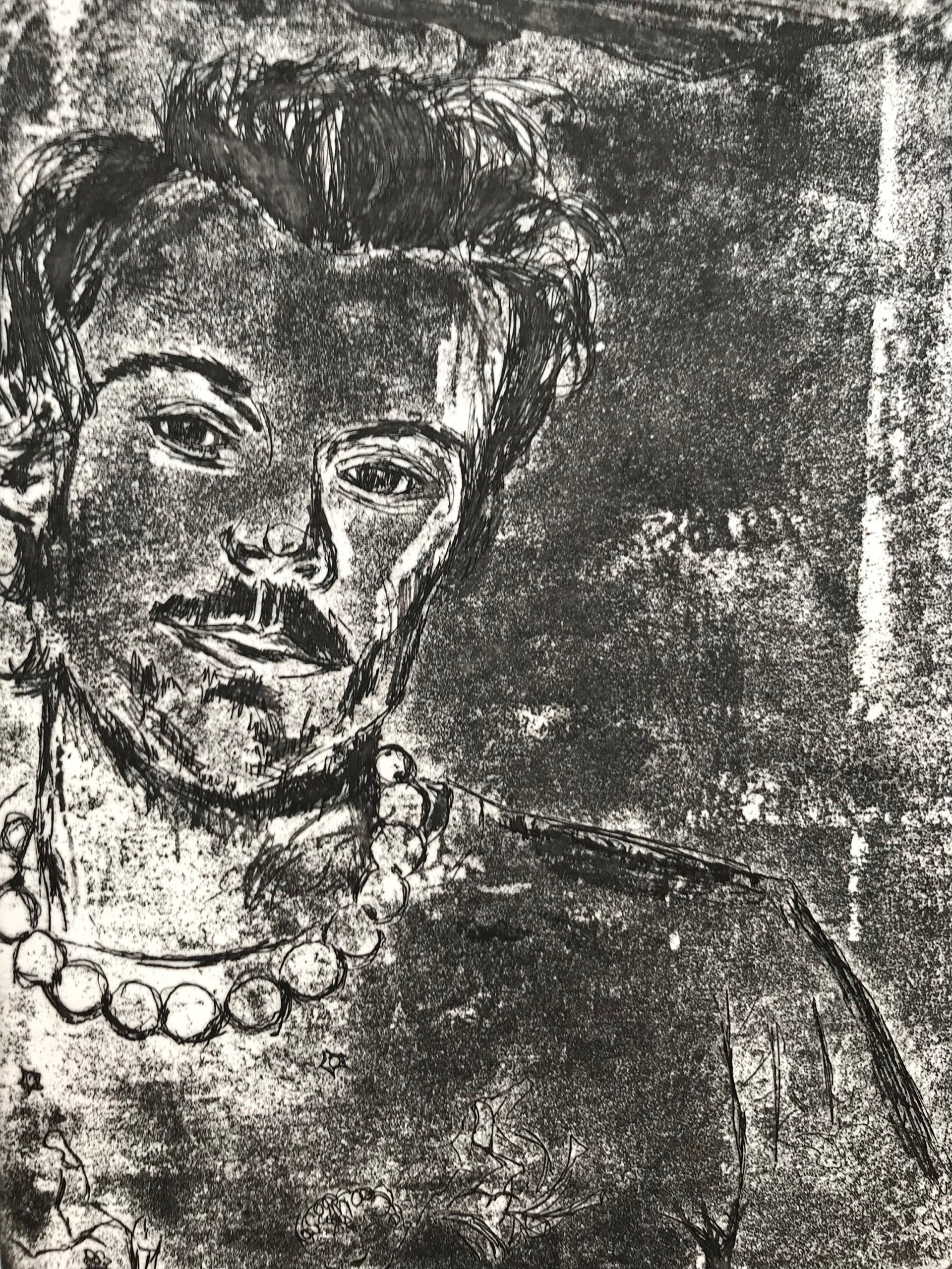
Ink Reflection Photo Etch